

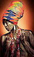
Photo source: @whowhatwearuk
There is
undeniably so much level of excellence depicted by those who create and promote
high fashion. Speaking of excellence, one of which, is the ability to mix and
match prints without needing to create a fashionable disaster. Whether it is an
animal print and floral print or windowpane print and plaid print, the
following outfits would prove to you that pulling off printed ensembles are
totally doable. Follow these simple rules so you too can pull it off in an
effortless manner.
Consider the silhouettes you are matching.
A silhouette
is what you see in a dress at one glance. When mixing and matching prints, it’s
very much necessary that you “pay rapt attention” to their silhouette. The
whole idea is to ensure that silhouettes do not dominate the graphics/prints.
Then only can you begin the process of
matching.
Match and mix colors, not prints.
This is probably
the most important tip to put into consideration. It’s vague to say match colours and not prints because
obviously, this article is subjected to prints. But let’s face it, you cannot
talk about prints and not talk about colours.
Colours are
the very fundamentals that you would definitely look out for when selecting
prints you’d love to ensemble. There are two ways to achieve this. It’s either
you match different prints with the same or similar colours, or you match
different prints with different colours, hence giving you a very sophisticated
look.


Photo source: @gallantgirl
Redefine your look with a solid colour
base.
A plain
white crew neck t-shirt tucked into a floral print palazzo pant isn’t a bad
idea you know. The white crew neck t-shirt acts a solid colour base to break up
the floral print palazzo pant. Also, taking a particular colour grade from your
print could suggest the solid colour base to be used. There just has to be
synergy between your colour base and print.
Let’s assume
you are to wear a green and black plaid patterned kimono, and you still can’t
wrap your head around what ensemble would complement the plaid patterned kimono.
You are left with no option but to add a solid color base to your overall
outfit. Now, I am sure you would ask ”what solid colour base am I to use then?”. The
answer is not farfetched. Since the kimono has two colours, you would be left
to decide what colour hits the most; Green or Black. Once you have chosen your
preferred colour, you then decide if this colour would be at the upper or lower
torso.
Obviously, a
pair of denim shorts would look great at the lower torso.
Now that the
lower torso is settled, you then decide if a green turtle neck shirt or a crew
neck shirt or just a green cropped top would be great for the upper torso.
Just play
around the idea of adding a solid colour base to your prints.


Photo source: Pinterest
Accessorize with Prints
Accessories can
be categorized into two general areas; those that are carried, and those that
are worn. It would be obsolete if after matching and mixing your prints, you do
not accessorize. To be very honest, accessories tend to leave a mark of
perfection into your overall ensemble. But for the sake of the subject in this
context, any fashion accessory would not just do.
We live in a
fashion generation where almost all accessories are printed/patterned. From
printed sunglasses, to printed umbrellas, to printed wristwatches…the list goes
on and on.

Photo source:@anthropologie

Photo source: Etsy.com
Practice Makes Perfect
Now that you
have understood the concept of mixing and matching prints, I encourage you to
keep implementing these hacks and tricks into your everyday fashion escapades.


Photo source: Pinterest


0 Comments
Thank you for taking the time out to read and comment. We really appreciate and look forward to reading them.
DISCLAIMER: All comments are made by the blog readers and NOT by the blog's author(s).